Information Architecture · Responsive UX · WordPress
Bäckerei Breitner
Modernizing a local bakery's website without losing its heritage. I organized the experience around real customer questions, then carried the bakery's tradition from first wireframes to a responsive WordPress site.
Client Website
Contributions
❥ UX/UI Design
❥ Webdesign using WordPress
❥ Content structure & Information architecture
Outcome
❥ Client website launched in 2023
The challenge
From a business brief to an everyday customer tool.
The bakery is a well-loved, traditional, and local business in the city. Their website needed a refresh to better serve customers and align with their new branding, while not losing their heritage.
01
Translate the brief into customer needs
Customers arrive with quick, practical questions: "What is available? When is the bakery open? Which branch is closest?". The business also needs to communicate its history and quality.
I used those two jobs to guide the project: make everyday information effortless to find, then let the brand story add warmth and trust around it.
02
Prioritizing
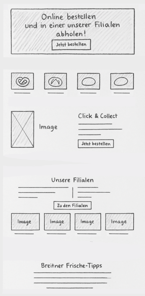
Content needed to be completely restructured to match customer needs. The shop should become more central, rather than a background consideration. Products, branches, opening hours, contact details, and the bakery's story each received a place, with frequently needed information brought closer to the surface.
What needed to be thereSketch of the homepage. The shop became the central entry point, with the bakery branches and locations right below it.
Translated into the real dealBased off the sketch, the actual homepage came to life. The header includes a dynamic video as an eye catcher.
03
Make the shopping experience tasty
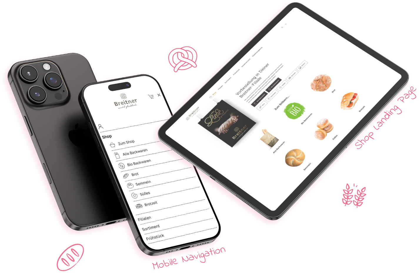
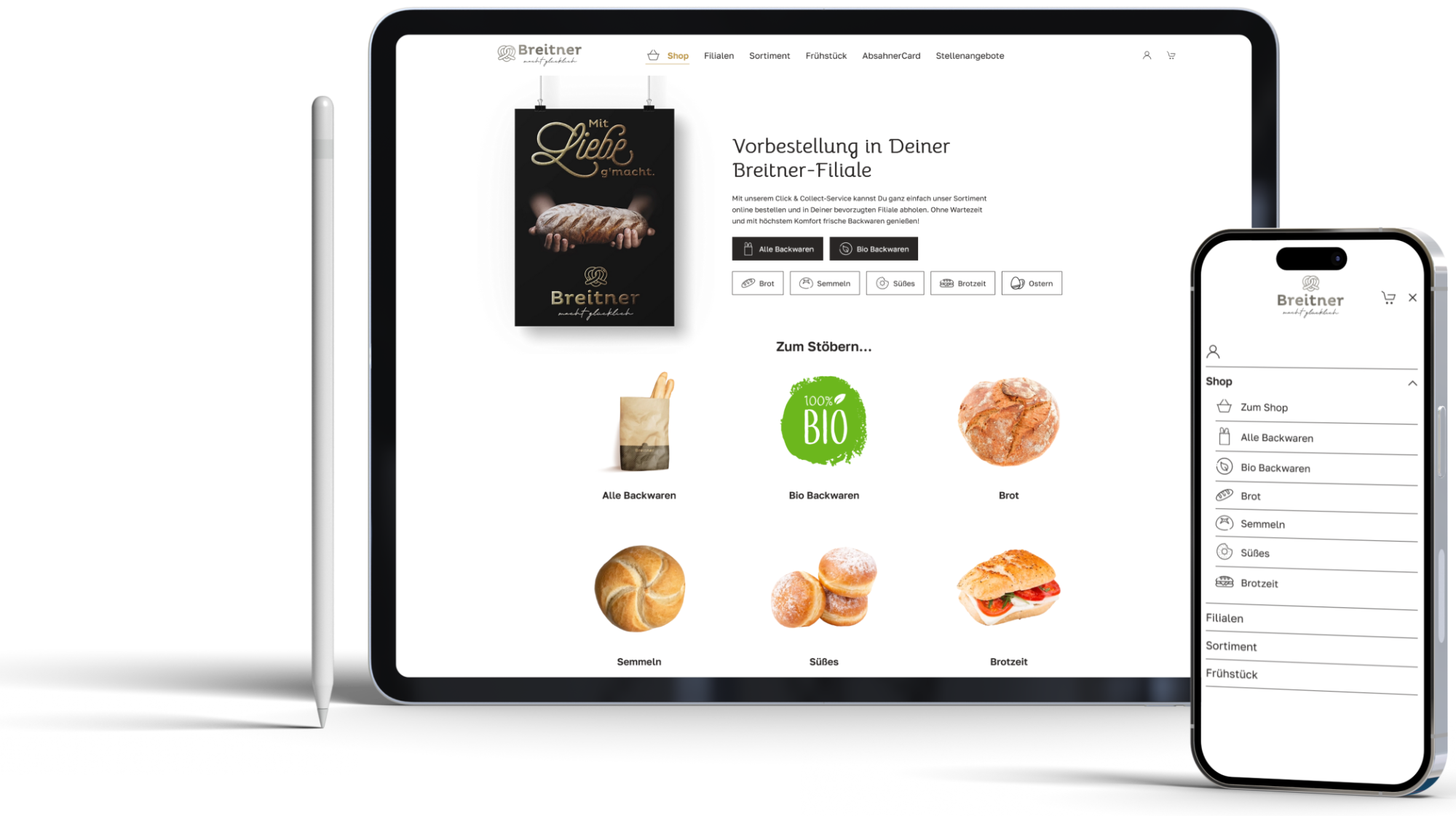
With the shop taking a central role, it also needed to feel enjoyable to browse. Clear categories, product photography, and generous white space make the assortment easier to scan while guiding customers toward ordering.
Designed for easy browsingThe desktop and mobile layouts group products into clear categories and highlight the click-and-collect flow.
04
Styles
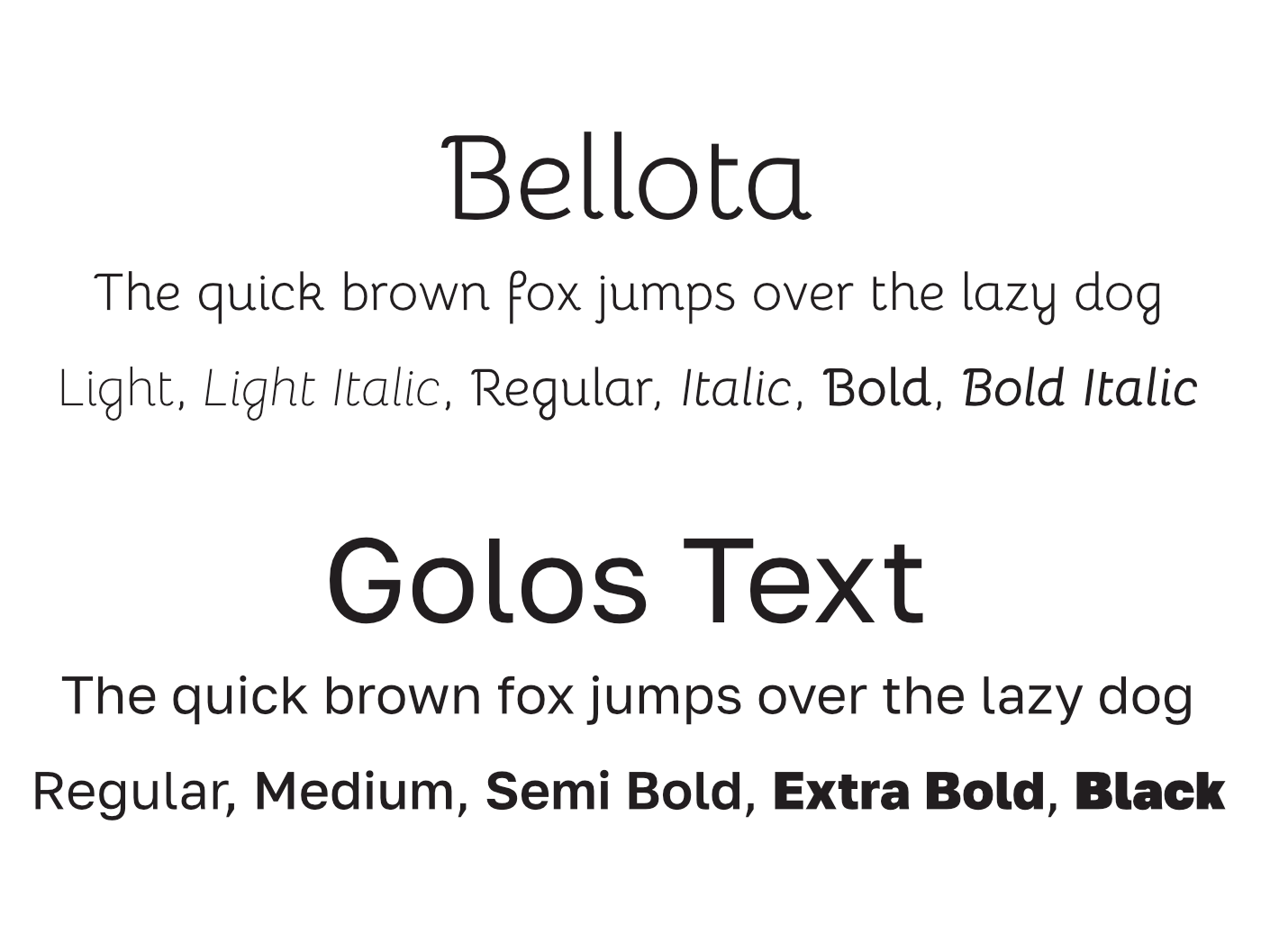
I paired Bellota's expressive letterforms with Golos Text's clean, readable shapes to give the bakery a distinctive voice without sacrificing clarity. Together, the typefaces balance a handcrafted feel with practical, easy-to-scan content.
Buttons make use of the charcoal and warm-gold colors. This combines modernity through minimalism with traditional values.
Button stylingBy default, buttons have white text on charcoal. On hover, this changes to white on gold. After selecting, it switches to gold writing and gold border to charcoal background.
TypographyBellota adds character to display text, while Golos Text provides readable body copy across several weights.
05
Build, check, and hand over
The final step was bringing the approved direction into WordPress and checking it with real content. Working on a live client project meant adapting to available copy and imagery, keeping the system maintainable, and resolving small responsive issues that only appear in the browser.
This is where the project moved beyond a polished concept: the design had to remain clear when content changed, work across common screen sizes, and be useful to the bakery after launch.
The outcome
A real website shaped by real constraints.
The launched site brings the bakery's identity and practical customer information into one responsive experience. It gives the business a warmer digital home while keeping products, branches, opening times, and contact paths easy to find.
Customers: Find
Branches, opening times, and contact paths are treated as primary information rather than buried details.
Brand: Feel
Typography, imagery, and bakery motifs communicate warmth and heritage across the experience.
Delivery: Live
The responsive website launched in 2023 and provides a concrete, public outcome for the case study.
Learnings
A practical UX process does not always begin with a large research study. In client work, the brief, audience needs, existing content, stakeholder feedback, implementation constraints, and browser QA all become design evidence.